Verizon
Conversational Design System
- Interaction design
- Design systems
- Conversational AI
- Component documentation
- UX engineering
Overview
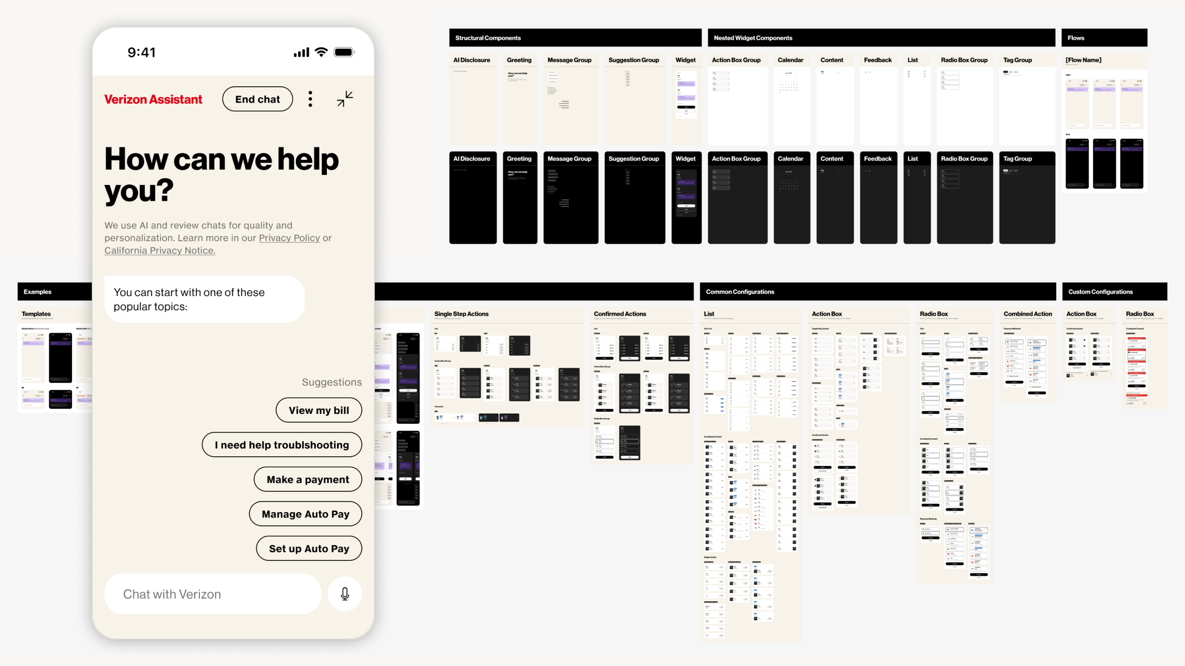
Operating within Verizon’s corporate design ecosystem, the objective of this initiative was to build the official Chat Expansion Pack—a specialized Figma component library designed to standardize conversational messaging layouts, interactive quick replies, and live-agent interfaces across the organization.
Challenge
Deploying automated messaging across varying digital touchpoints introduces fragmentation risks if product teams build ad-hoc chat patterns. The challenge lay in constructing a modular sub-system that explicitly honored Verizon’s established design system tokens and typography styles, while delivering the precise layout variations and usage guidelines required for multi-threaded dialogue configurations.
Solution
Designed, specified, and deployed a robust conversational UI library, following established global design and documentation guidelines. By anchoring the library with an extensive component sticker sheet, explicit rule specifications, and a simulated message app flow environment, the expansion successfully protected brand consistency and unified cross-functional design delivery.
Role
I was a Contract Experience Designer, supporting chat product stakeholders, end users, and the conceptual design lead. I collaborated with engineers, designers, and design system leadership.
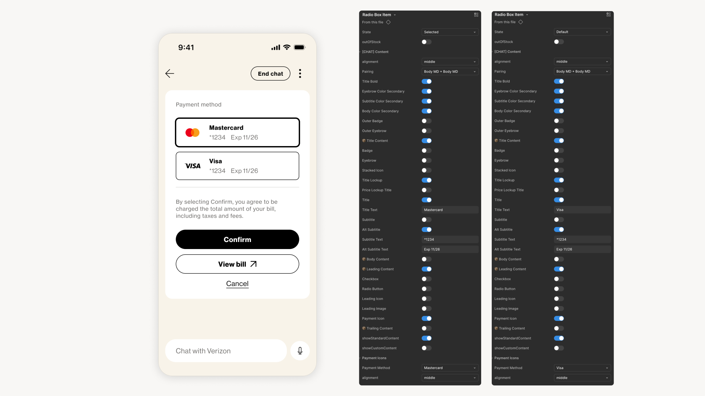
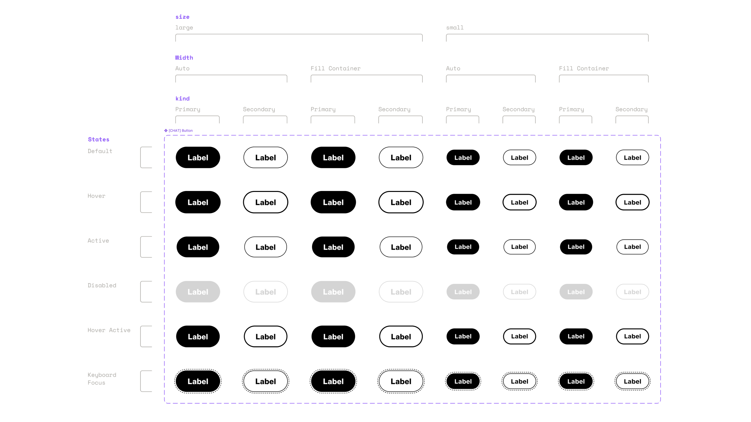
01 / Component Modularity & Systemic Scaling
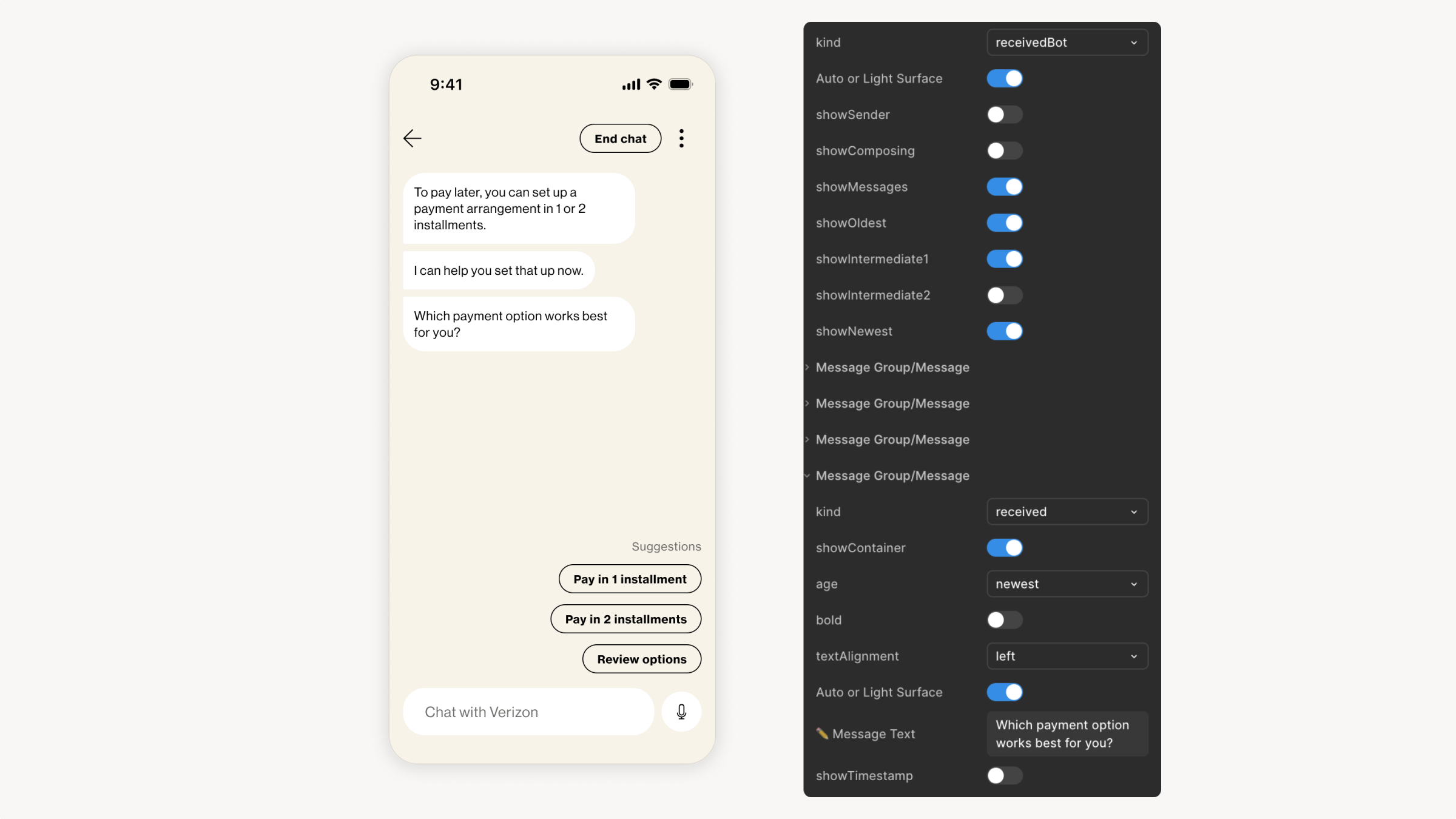
Authored scalable Figma components leveraging auto layout and conditional surface logic, ensuring visual flexibility within strict brand boundaries.
Auto-Layout Adherence
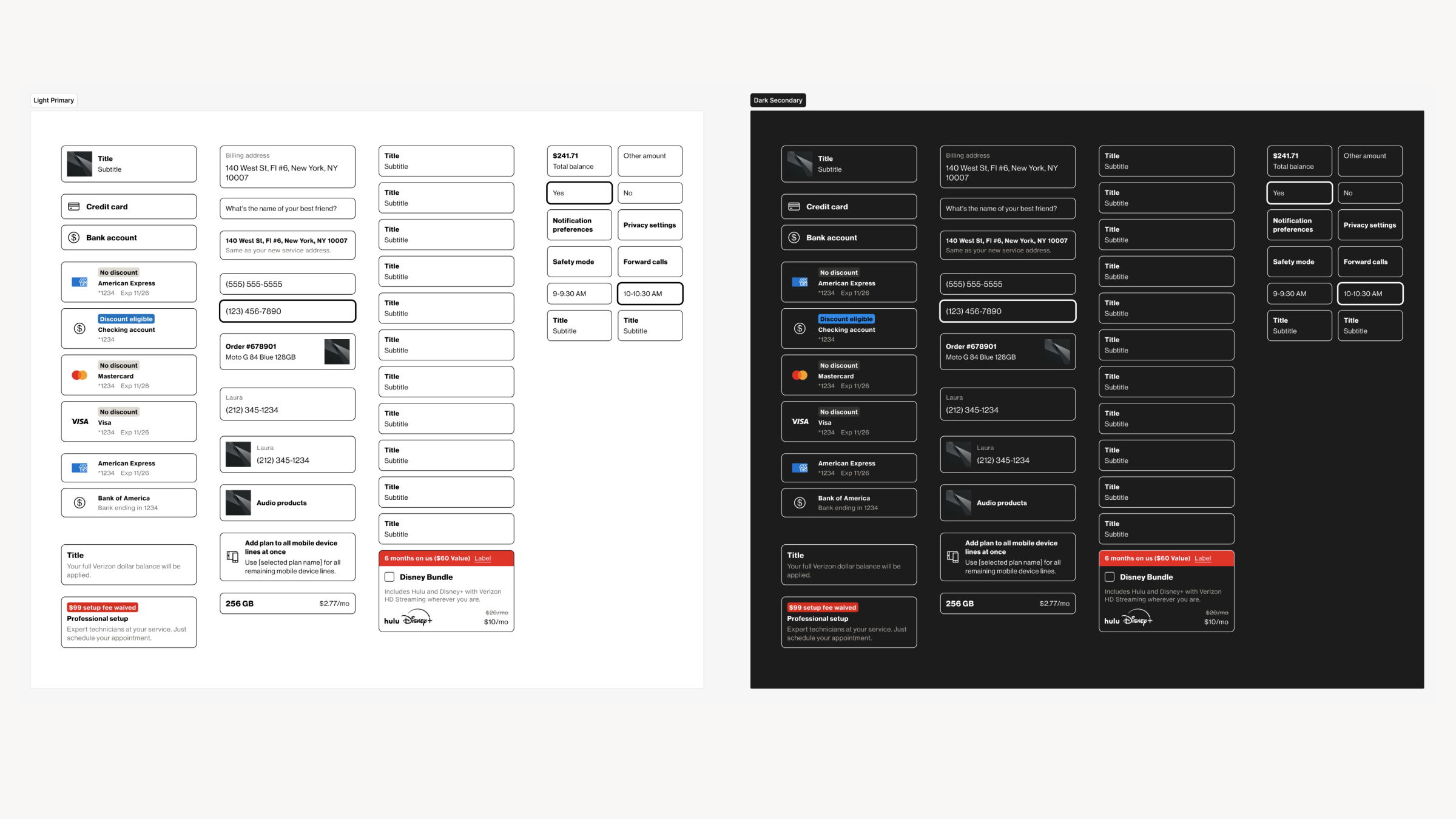
Built a multi-variant component library using rigorous Figma auto-layout parameters to allow text strings and media containers to expand dynamically without clipping.
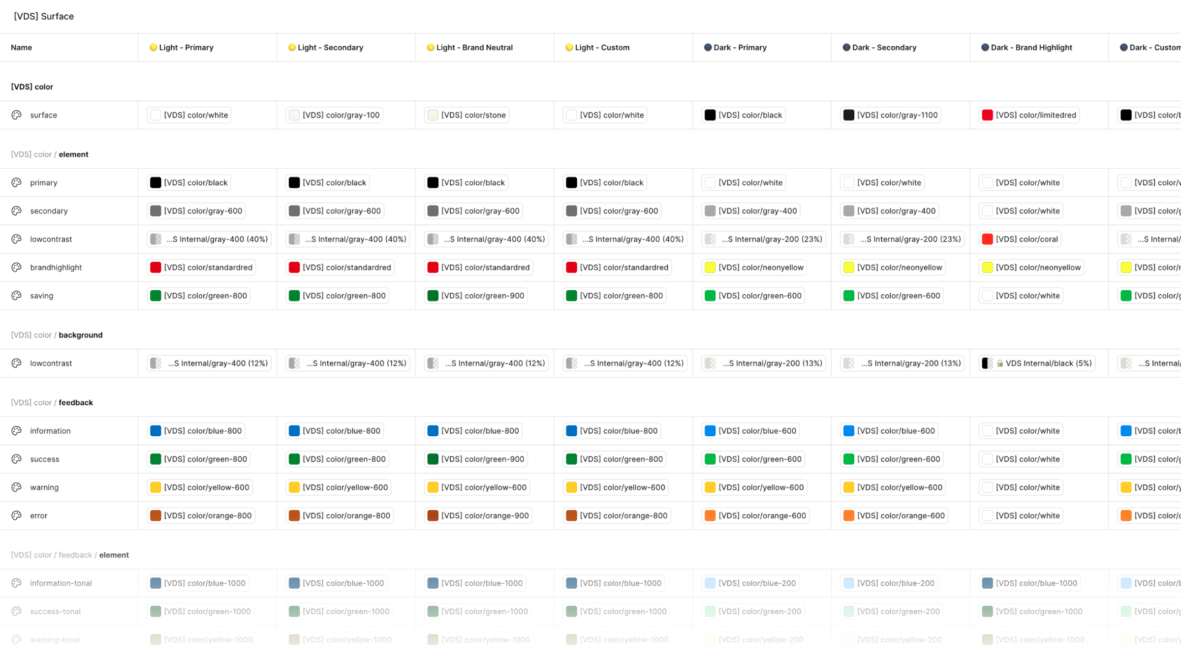
Alignment with Global Variables
Synchronized all specialized sub-system visual variables with pre-existing global design system color, spacing, border radius, and typographic tokens to maintain absolute compliance.
Component Ease-of-Use
Leveraged best practice property types, taxonomy in alignment with the core design system, and nested component methods, significantly minimizing file weight and allowing product designers to easily configure components according to their learned behavior using the global system.
02 / Governance, Specs, and Documentation
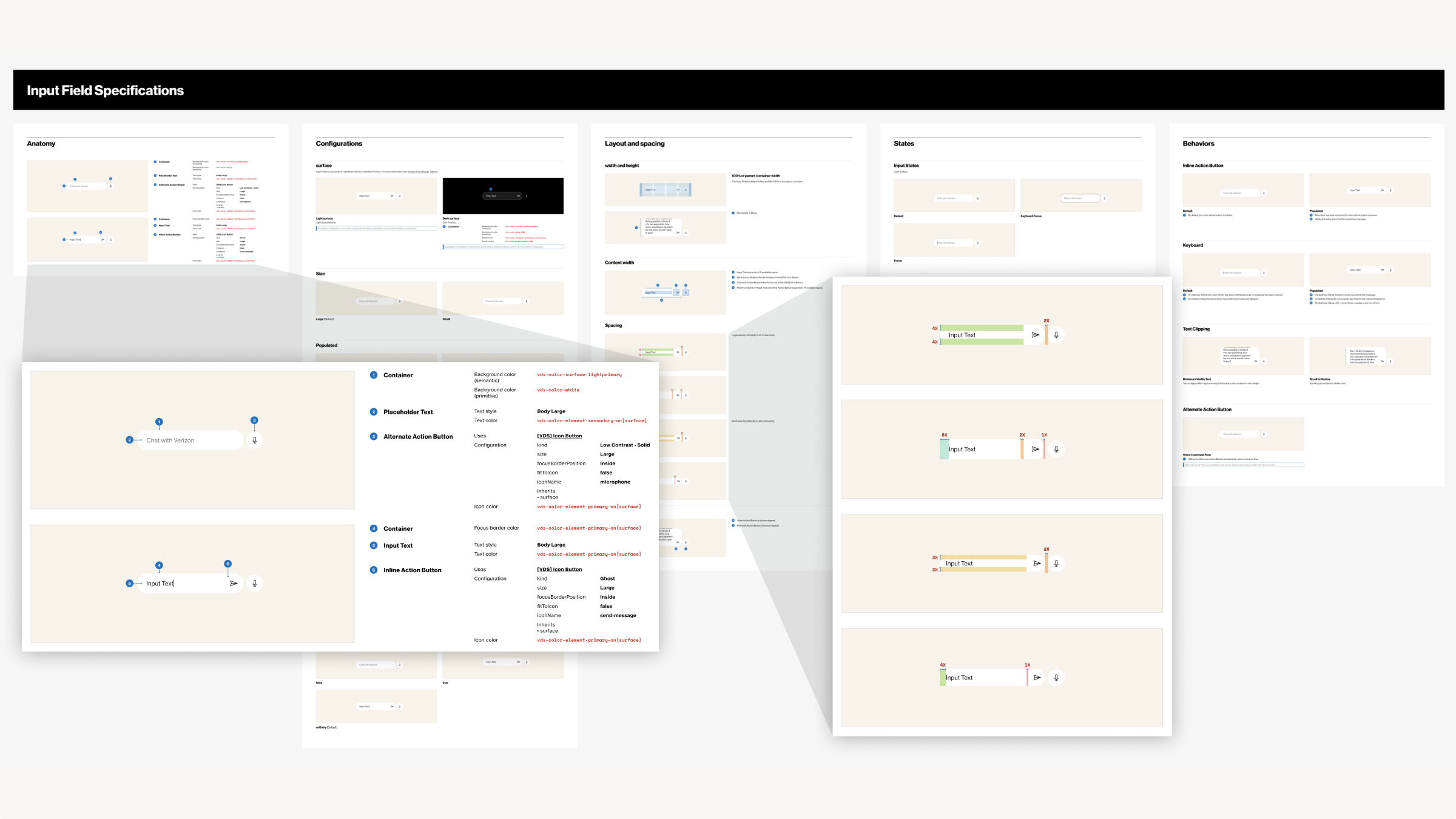
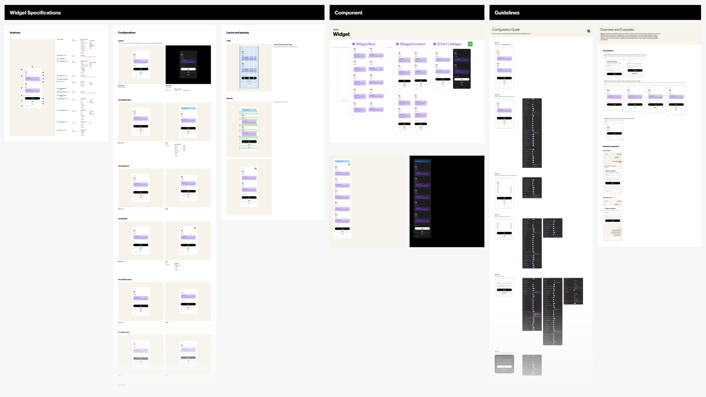
Authored self-serve technical guidelines to empower product teams to use the new conversational system correctly without requiring ongoing repetitive instruction from global design system staff.
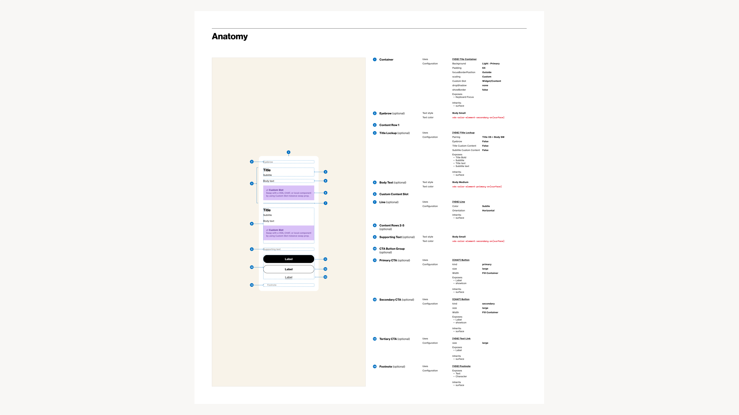
Engineering Specifications
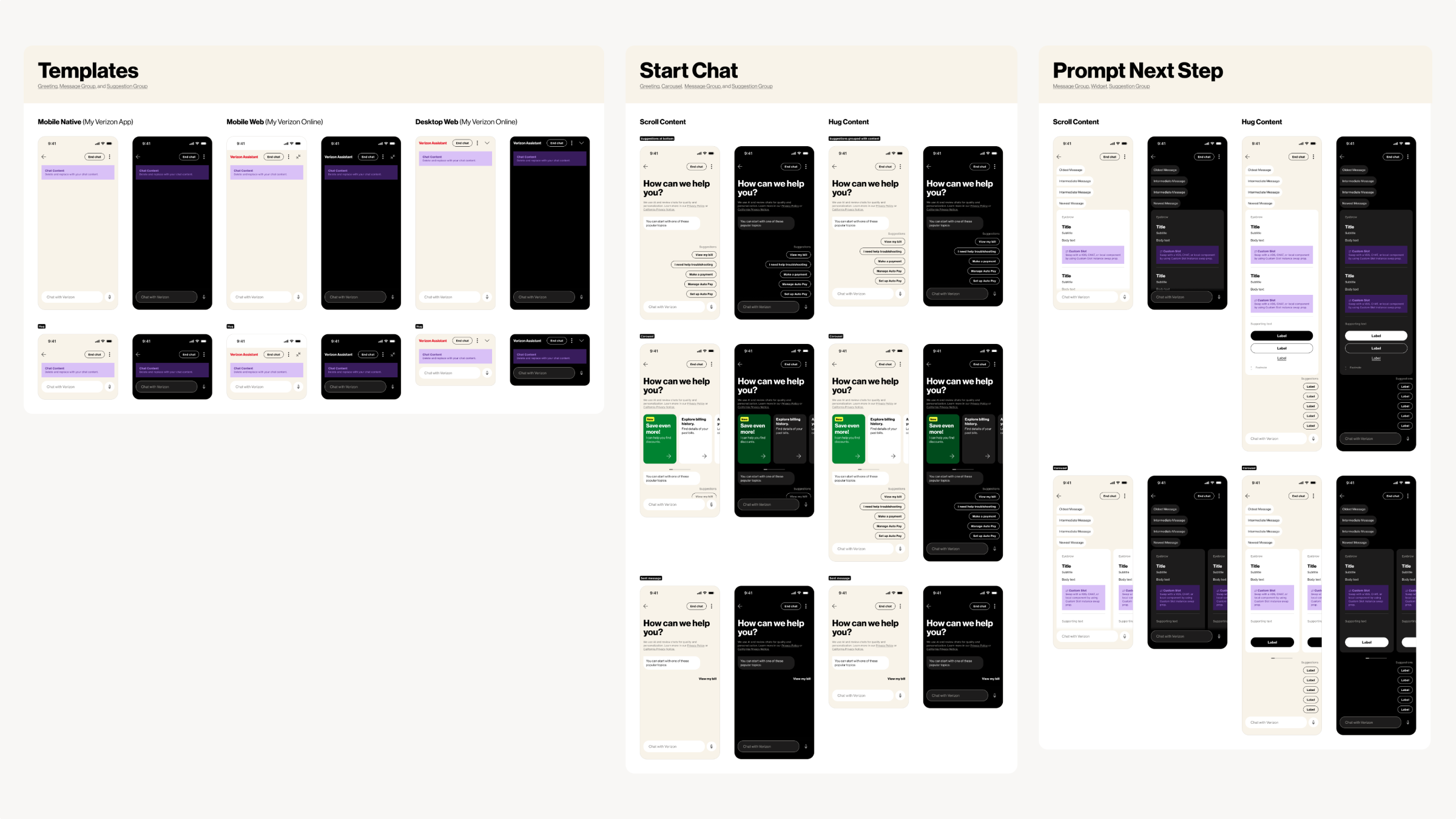
Drafted exhaustive component anatomy sheets that explicitly call out spacing, token values, nested components, property configuration options, and text-wrapping thresholds for developers.
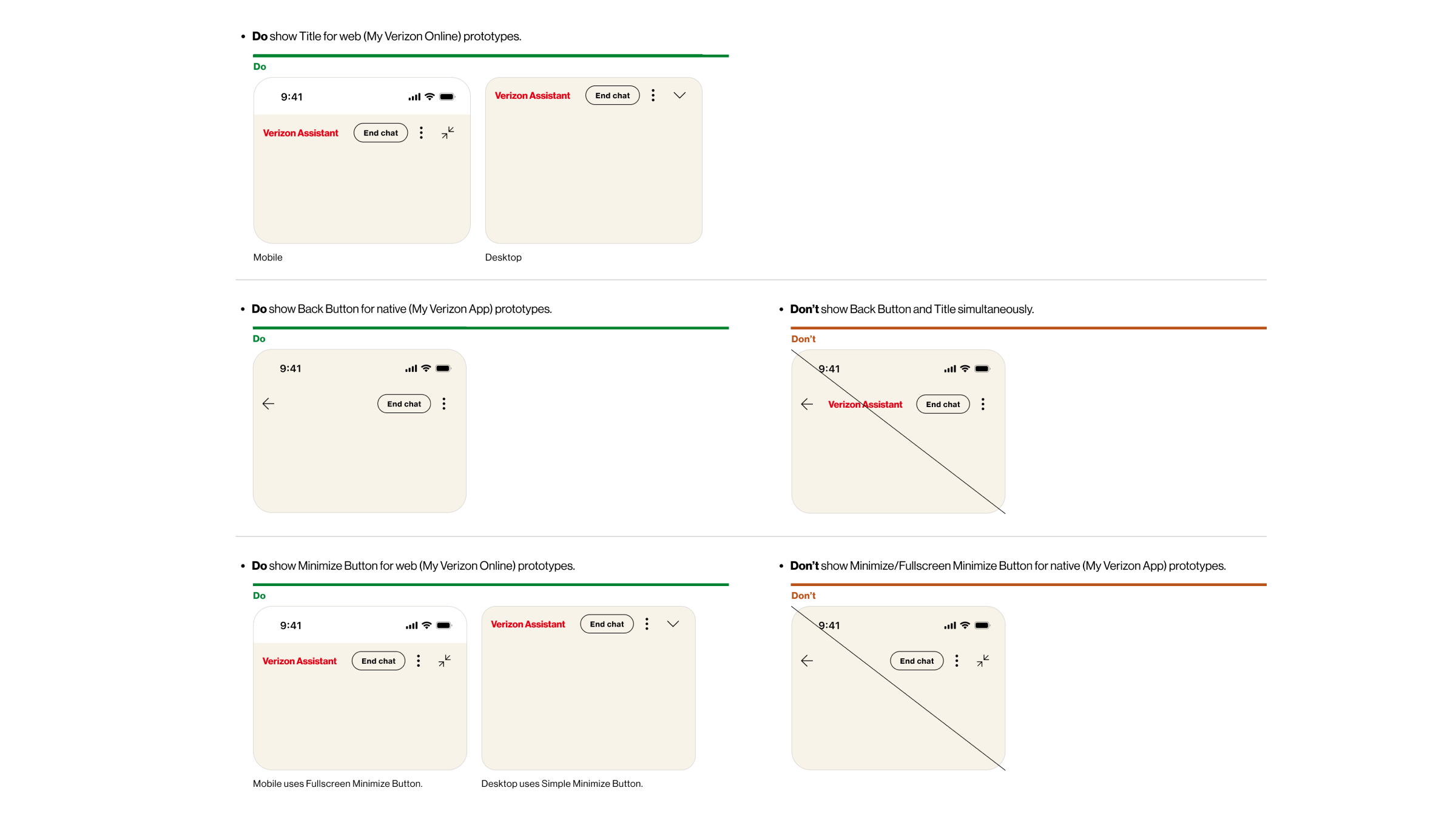
Usage Guidelines
Authored contextual "Dos and Don'ts" usage frameworks to visually guide product designers away from incorrect component configurations, prohibited nesting combinations, and content mismatches.
Active Partnership with Developers
Consistently paired with developers for live coding sessions and performed design QA to close the interpretation gap between design staging and front-end implementation.
03 / Workflow Verification & Immersive Prototyping
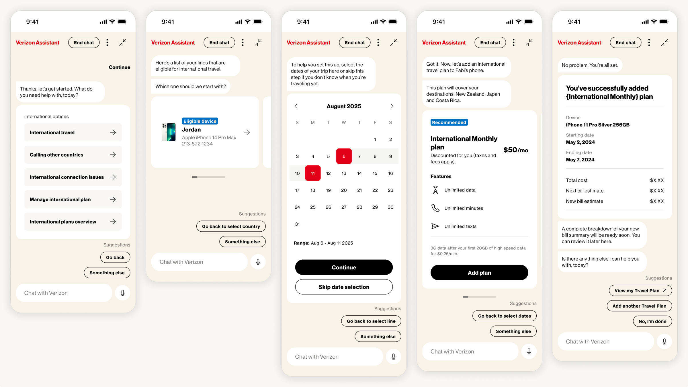
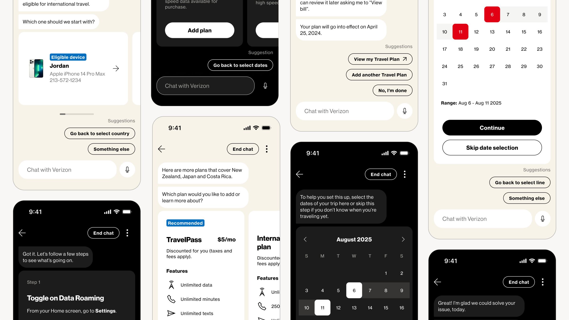
Stress-tested the structural layout constraints of the chat expansion pack by assembling components into complete, end-to-end interactive mockups.
Realistic User Flows
Grouped isolated UI elements into comprehensive linear flows to test information density and screen hierarchy against real-world messaging scripts.
Edge Case Identification
Based testing on lead designer's extensive audit of chat product implementation across the company to ensure all edge cases like extreme character-length expansion and custom content are supported.
Streamlined Product Design
Developed pre-configured layout baselines for fast deployment, streamlining product team prototyping cycles to a drag-and-drop workflow.